Saturday 24 November 2012
Digipak Design Final Edit
Front Cover & Spine

Back Cover & Spine

Booklet (Inside Left Panel)


CD Housing - (Inside Right Panel)


From gathering feedback on the design of my digipak, I learnt that many people felt that the image used on the digipak front cover should be in colour as it appears in colour on the magazine advert. I re added the image of the hands forming a heart and altered the setting slightly so that the image wasn't too dark.
I also darkened the font used for the artist name and made the album title bigger so that they stood out against the background image. I also positioned the album title slightly lower down so that it wasn't overlapping the thumbs on the background image. By positioning it over the white dress on the background image, this helped it to stand out.

For the back cover of the digipak, I only made slight changes. Some people suggested that the image would look better if the both the record label logos used on my magazine advert were included. I added the 'Island Jam Records' logo and made both slightly smaller so they fit neatly next to the barcode. I also darked the right side of the image slightly so that I could add the track listing in a more interesting way. I made the new darkened area of the image blend in with the original image by using the eraser tool on a soft setting.
I also changed the font used for the track listing as I felt the first font I used was plain and boring. However I kept the same white colour for the font as the text stands out clearly from the background image in this colour.

(Booklet Cover)
No changes were made to the booklet cover as I am happy with the design I originally came up with.
(Internal booklet pages)
Even though I recieved some comments in the feedback for my digipak design, saying that the internal booklet pages were a little simple. Therefore I looked at other booklets inside digipaks and decided that the design of the booklet pages is suitable as most lyric pages in booklets are quite simple. Therefore I made no changes to the booklet pages.


CD Housing - (Inside Right Panel)

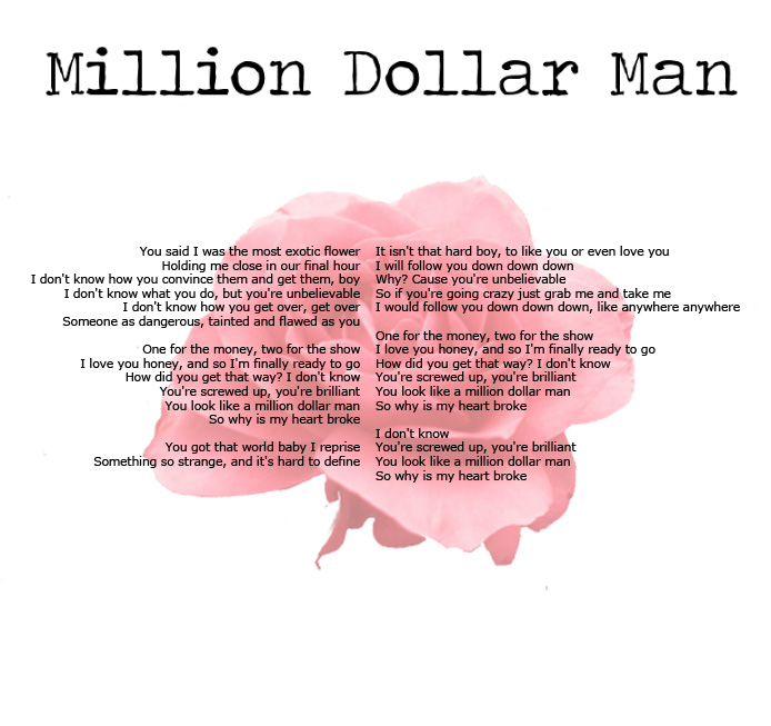
Even though I wasn't given any negative feedback for the CD Housing panel, I decided to change the rose image in the background, cropping the image used on the internal booklet pages. I altered this to make it more red so it stands out. The black area represents the CD and how it would sit over the top of this image.
Magazine Advert Final Edit
.jpg)
This is my final edit of my Magazine Advert to advertise the album. I made minor adjustments to the design, following the advice given to me through feedback on my first draft design.
Firstly I lightened the background image slightly, as on my first draft the image was a little dark and therefore the font used for the artist name didn't really stand out as well from the poster. I really liked the font I had chosen so didn't really want to change it, so to help it stand out even more I darkened the text so that it stood out more. I tried changing the colour of the font to reflect the colour from the roses at the bottom of the advert but didnt like the results, so left the text black. I also changed the size and positioning of the album title text. This is because it overlapped part of the thumbs in the background image and again this didn't allow the text to jump out as part of it was overlapping a dark image. I made the text slightly smaller and then moved it down slightly so that is was positioned over the white area of the background image.
After looking back at the magazine adverts I had analysed and reading peoples feedback, someone had commented on the fact that there wasn't any websites added to the poster. Using a small white font, (the same as the one used for the reviews), I added in a website for the artist and also a website for the record label. Some people had also said that in the top left corner it looked slightly blank and off balance, as my advert had some aspects of symmetry, and suggested that I add something to that top corner. I added another record label logo in that corner to balance out the design.
Friday 23 November 2012
Thursday 22 November 2012
Evaluation - Question 3
Audience Feedback Part 1 - Music Video
Audience Feedback Part 2 - Magazine Advert & Digipak
Audience Feedback Part 2 - Magazine Advert & Digipak
Wednesday 21 November 2012
Monday 19 November 2012
Subscribe to:
Posts (Atom)